This article was written on 6 November 2026.
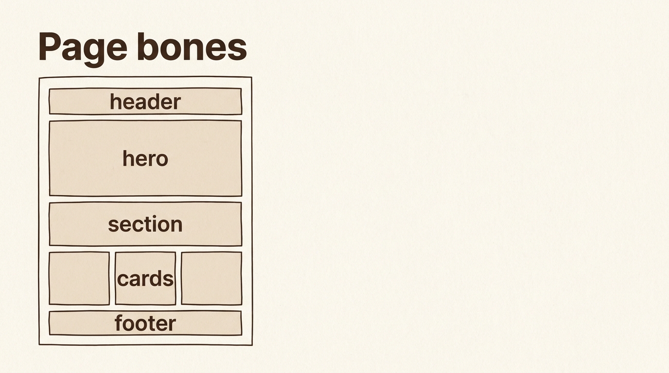
AI tools change fast. The bones of a page do not. Header, hero, section, footer, navigation, card — a person can learn these six and already brief a first screen. Menus inside products will move. Read this as the map of a page, not as a tour of a builder’s panels.
Before decoration, a page is a sequence of jobs. Something tells you where you are. Something says what this place is, once. Something repeats a kind of fact. Something points to the next place. Something closes the page. When those jobs are unnamed, a model invents a poster: one large picture, floating text, and no way down. The page looks finished and cannot be used on a phone.
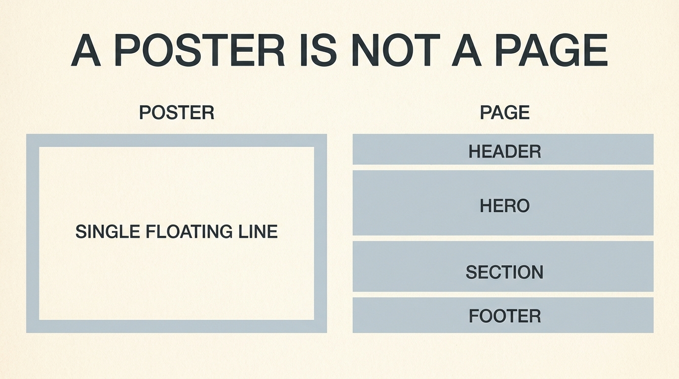
Name the jobs in English in the request, and explain them in your language underneath. If your language already has a stable word, use it with the English in parentheses the first time. If it does not, do not coin one. A short explanation plus the English noun is enough.
Six places, in the order a person meets them
A header is the thin band at the top. It holds the name of the place and the few ways out. It is not a second hero. If everything important is in the header, the page has no top, only a crowd.
A hero is the first large area. One claim, one sentence of support, one action. A clinic might say what it treats and offer “book a visit.” A shop might say what it sells and offer “see today’s bread.” A hero that contains the whole business is a brochure glued to the top. The rest of the page then repeats it, and the phone user never arrives at a price or an address.
A section is one topic with a heading. Hours. Prices. People. Questions. A section is how a long page becomes skimmable. Ask for sections by the question a visitor actually has, not by the word “section” alone. “A section titled Hours, with the week written as text, not as a picture” survives translation. A picture of a timetable does not.
A footer is the close. Address, hours again if they matter, a way to write to you. People who are lost scroll to the bottom on purpose. A footer that is only a decorative band fails them.
A navigation is the short list of places, usually in the header. Five items is already a lot on a phone. More than that belongs behind one control, not in a row of shrinking words. Do not ask for a navigation that repeats every section heading. That is a table of contents pretending to be a site.
A card is a repeated box for one fact of the same kind: a service, a class, a product. Each card gets the same slots. An icon or a picture if you truly have one, a title, one sentence, one action. Cards that each invent a different layout are not a set. They are five posters.
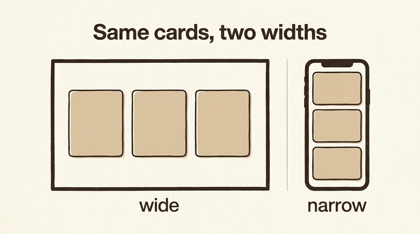
The same cards, two widths
A page that is only designed at desktop width is a page that breaks in the countries where the phone is the computer. Say the columns. On a wide screen, three cards in a row. On a narrow screen, one card under the next. The words inside the card do not change. The row breaks. That is a responsive layout, and it is a condition, not a mood. “Make it responsive” lets the model choose a break that hides the button. “Three columns when wide, one column when narrow, the action staying visible” does not.
Tablets can sit in between, at two columns. You can say so. You do not have to. One and three already teach the idea: the content is a list, the row is a luxury of width.
A sticky header — a header that stays put while the page moves — is optional. It helps when the navigation is the way back. It hurts when it eats a third of a short phone. Ask for it only if the way back is more important than the next paragraph. Say “sticky header” if you want the English name. Say the condition too: it stays short, and it does not cover the first heading.
A page that looked finished and could not be used
A small clinic asked for “a beautiful homepage.” The model returned one tall picture of a hallway, a slogan across it, and a row of pale icons with no sentences. On a laptop in the shop it looked calm. On the phone at the bus stop the slogan covered the doorway, the icons wrapped into an unreadable strip, and the hours were baked into the picture, so they could not be translated and could not be read by a person using a screen reader. Nothing on that page was a header, a hero, a section, or a card. It was a poster that had learned to scroll.
The second brief named the bones and kept the beauty out of the sentence. Header with the clinic name and three links: visits, hours, how to come. Hero with one sentence and a button, Book a visit. Three sections, written as text. A set of cards for the three kinds of visit, three across when wide, one under another when narrow. Footer with the address as text. The page became ordinary, which is what a person at a bus stop can use. The picture of the hallway could still exist, inside the hero, smaller than the sentence. It was no longer the page.
That is the change these six words make at work. They stop a model from spending the whole answer on atmosphere. Atmosphere can sit inside a region. It cannot replace the region. If you are briefing in Indonesian, Hindi, or Arabic, write the six English names in the request and write the clinic’s real sentences underneath. The bones travel. The sentences stay where the patients are.
What this changes about the first brief
A first brief can be one paragraph.
Build a page with a header (the name and three links), a hero (one sentence and one button), three sections, a row of cards that becomes a single column on a narrow screen, and a footer with the address as text.
Under it, in your language, write what the three sections are. The model does not need your language to place a header. You need your language to decide that the sections are hours, prices, and how to arrive, rather than a slogan repeated three times.
This is the page almost every small organization actually needs. It is also the page a model will overdress if you only say “modern and clean.” Modern is not a region of the page. Header, hero, section, footer, navigation, and card are. Learn these, paste them in English, and keep the facts in the language of the person who will read them.
The next decision is not another region. It is what happens when the page must ask the person something, or show them another set of facts without sending them away. That is a different shape from a section, and it is the next article.