This article was written on 6 November 2026.
AI tools change fast. The amount of motion a page can bear does not. Hover, a short transition, and a small response to a tap are enough to pass. Glass, parallax, staggered entrances, carousels, and scroll that snaps into place can be recognized and refused. Read this as a limit, not as a motion guide.
Models add motion because motion looks like effort. A still page looks unfinished in a demo and finished in a waiting room. The people this series is for are closer to the waiting room: a phone, a bright street, a language that may not be the model’s first, and no time for a page that moves while they are trying to read a price. Motion is justified when it explains a change. It is not justified when it explains that someone knew the name of an effect.
Three that earn a place
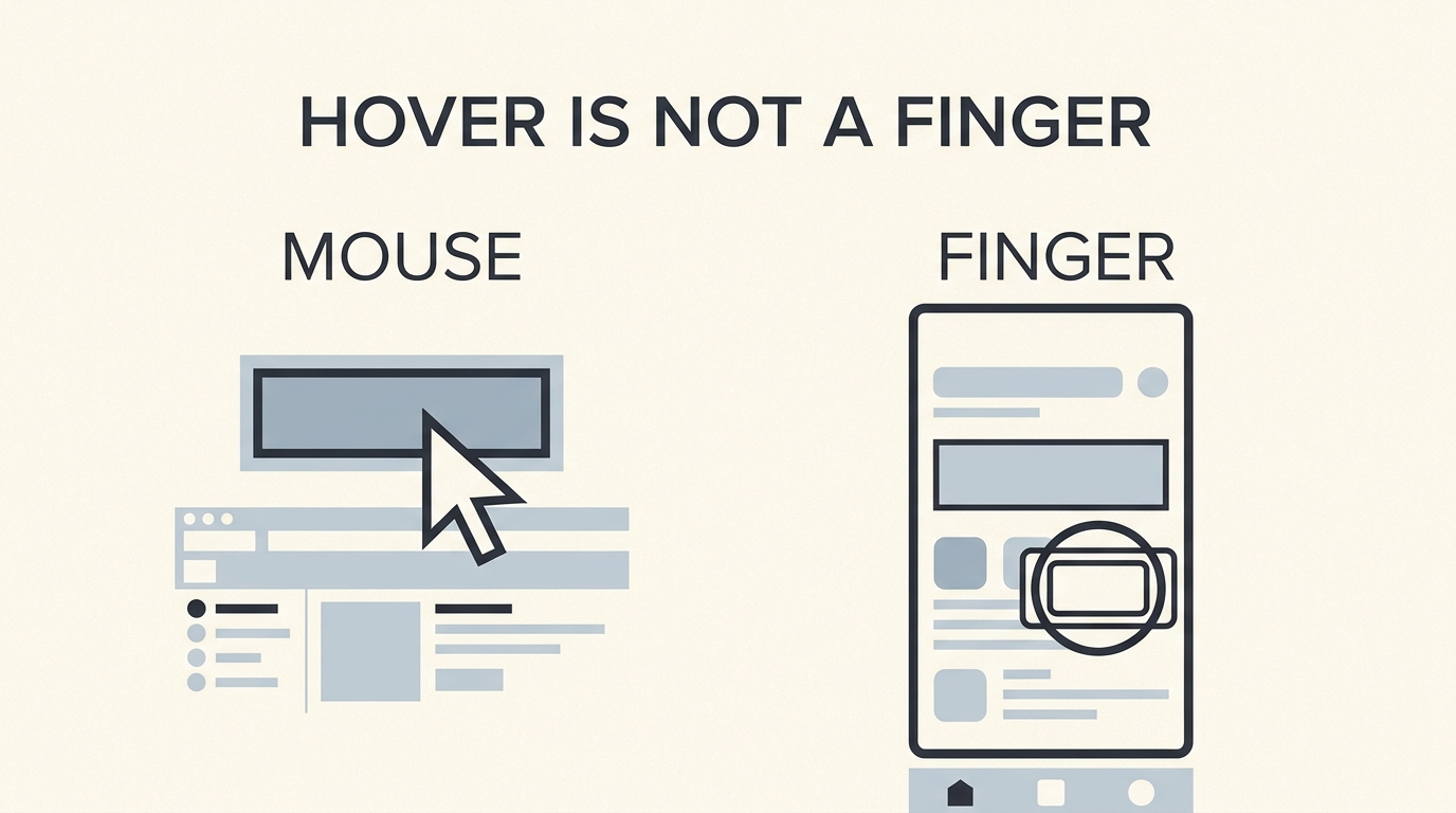
A hover is a change when a pointer rests on a control: a slight shift of color, an underline on a link. It tells a person with a mouse that the thing can be used. It does not exist for a finger. Anything that is only visible on hover is invisible on a phone. Say that the same cue must appear on focus, for a keyboard, or not at all.
A transition is the short time a change takes, often around a fifth of a second. A drawer that appears in one frame feels broken. A drawer that takes a second feels late. Ask for a short transition on the open and the close. Do not ask for a transition on every letter of a sentence. Reading is not an event.
A microinteraction is a small reply to a small act. The save control briefly confirms. A chosen chip looks chosen. It is the same honesty as a toast, drawn smaller. It is not a mascot, a confetti burst, or a sound. If you cannot describe the reply in one clause, it is already too big.
Names you only need to recognize
These are real words. They are not the words a first page has to pass through. When a model offers them, you can say no by name.
- Glassmorphism — a frosted panel. It lowers the contrast of the text on it. If the words are hard to read, take the glass off.
- Parallax — backgrounds moving at another speed than the text. It makes some people ill. It also fights the system setting that asks for less motion.
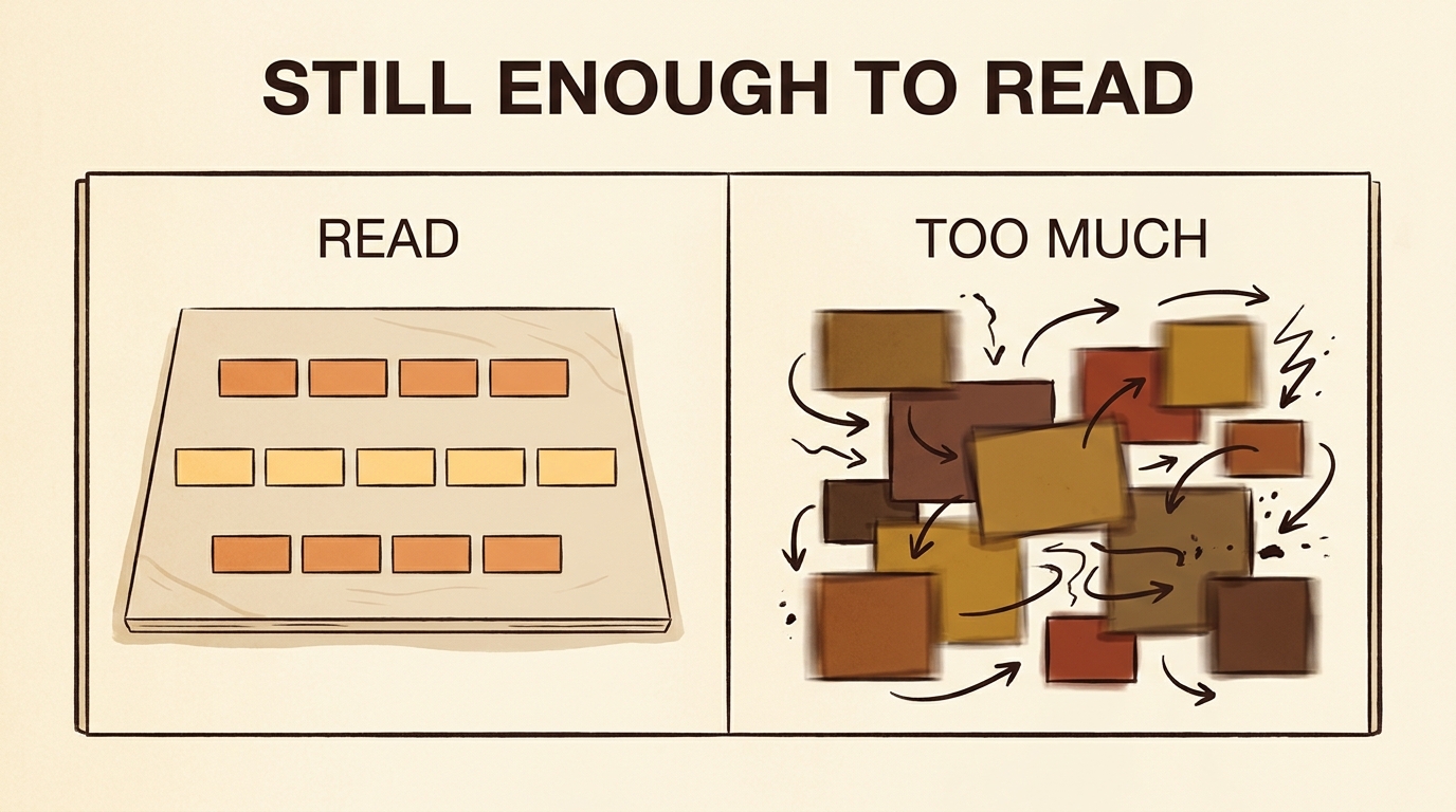
- Bento — a grid of unequal boxes, named after a packed lunch. Useful later for a dashboard. On a first page it hides which fact matters, because size is doing the arguing.
- Stagger — items appearing one after another on a delay. The person waits for a list they could have read.
- Carousel — a row that slides sideways. Most people never pass the first slide. Put the fact in the page instead.
- Scroll snap — the page locking to the next full screen. On a phone it traps people between sections they meant to skim.
You do not owe these a paragraph of practice. You owe them a refusal when they arrive uninvited. “No glass, no parallax, no carousel, no scroll snap. Short transitions only.” That sentence is a complete brief.
A price, outdoors
Someone is standing outside a shop, holding a phone in sunlight, trying to read what a class costs before they go in. The page they were given slides the price in after a delay, lays it on a photograph of the street, and moves the background slower than the text. In the demo, on a desk, it looked crafted. In the sun it looks like a page that will not hold still long enough to be trusted. The person goes in and asks. The page failed at the only job it had.
This happens faster in places where the phone is the only screen and the street is the office. A motion effect that needs a dim room and a large monitor is not a neutral default. It is a default copied from a studio. Naming the effect is how you decline the copy. You do not have to insult the style. You have to say which noun you do not want, in the English the model already uses, so it does not sneak back in under “make it nice.”
The brief that prevents this is short, and it uses the names so the model cannot translate “make it calmer” into a different decoration. No carousel for the price. No glass behind the number. No parallax. No stagger on the list of classes. A short transition when a drawer opens, and no transition at all if the person has asked the phone for reduced motion. Dark text on a flat light surface. The price is the first fact in the section, not the second slide. You can write that paragraph once and reuse it on every page you brief this year. It will stay true longer than the effect that tempted the model.
The setting that outranks the effect
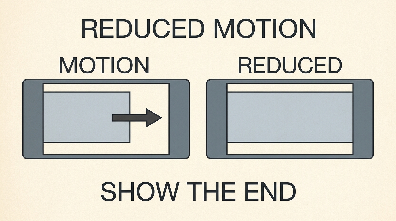
Operating systems let a person ask for reduced motion. A page that ignores that request is not lively. It is disregarding a stated need. Say this in the brief: if the person prefers reduced motion, show the end state at once, with no slide and no stagger. The information stays. The trip is cancelled.
Contrast survives every fashion. Text on a photograph, text on glass, text in a pale gray that looked elegant on the model’s canvas — these fail in sun, on cheap screens, and for tired eyes. Ask for dark text on a light flat surface unless you have a real reason not to. A name for the surface is optional. Readable words are not.
The path through this series was never forty definitions. It was four decisions. Name the part in English so the model does not guess it. Put the reader’s language in the labels and the facts. Choose whether this moment stops, shares, or only informs. Then keep the page still enough to read. A person who can do those four things has passed the vocabulary that actually gates the work. The rest is a catalogue they can open later, by the English name, when a page truly needs it.